When atsec was about to be founded, one of the first questions the founders (a German, an Italian, and a Swede) had was which name would best represent the company’s approach to information security, but more importantly, whether the domain would be available.
Here is the list of all the available domain names in December 1999 that were possible candidates:
- attento
- atsec
- atcert
- atcrypto
atsec, atcert, and atcrypto were considered along with attento, which means “watch out” in Italian; attento was eliminated since it had meaning in Italian only and not much in the large Anglo-Saxon market where the company was about to appear.
Even though we bought the domains atcert.com and atcrypto.com, we decided that atcert and atcrypto did not fit our service portfolio because one would limit the perception of the company to a certificate authority and the other to cryptography.
The decision landed on atsec, which is a short version of “atsecurity.” The choice of the “@” in the logo seemed the most logical thing to do at the time. In particular, the “@” sign would signal the company’s core commitment to IT security. Also, atsec was a new word that did not exist before then.
The first logo was plain and simple.

The color red symbolizes passion for the subject, and the italic font portrays speed and movement, like a Formula 1 race car.

The red line on the left represents the four guiding principles to be consistently followed.
| – Know the business. | – Act with integrity. |
| – Stay focused. | – Be independent. |
Finally, the reversal of the word “atsec” is the word “cesta,” which means “basket” in Italian, and it is always associated with a basket of goodies.

Passion, speed, and a basket of goodies: atsec was born. It was January 11th, 2000. A brand-new word, logo, concept, and a basket of good IT Security experts. We had a winner!
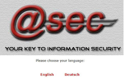
The second logo was a bit catchier but did not last long.

The word “key” was somehow limiting atsec to cryptography.
In 2001, during a consulting engagement at a prominent Internet Service Provider (ISP) in Germany, the motto was formed by playing with the acronymous “ISP” to make “atsec: the information security provider.”
The expression completely defines atsec‘s mission, dedication, and commitment to “Information Security.”
The first full logo with the motto was born sometime in early 2001.

In 2005, the logo was restyled and has remained the same to this day.

This logo has been trademarked and copyrighted since 2006. The website design has changed several times but has always been kept simple, with no flash or pop-up windows.
For atsec, information security is a science. However, the cultural components were never to be underestimated.
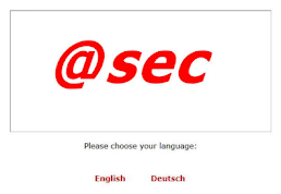
Our first two websites were just plain and simple with the logo and language options.
The first relevant version of the atsec website came later in 2001. It was a simple design focused on content and news from our projects.
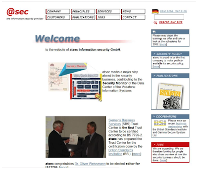
The first website’s transformation came in 2003 and stayed the same until 2010.
Teamwork and expansion were emphasized in the message by choosing a sailing boat as a symbol. Incidentally, from 2003 to 2010, atsec expanded in the US by establishing a branch in Austin, TX in 2003. This was followed, a few years later, by Stockholm, Sweden, and then Beijing, China.
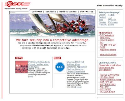
It is worth noting that ours was probably among the first information security websites that was translated into 10 languages, one of them even being Latin!
By the way, the sailing boat theme is still used in some of our marketing material.


In 2010, the website changed and moved to a futuristic design. Futurism was an artistic movement that originated in Italy in the early 20th century. Its emphasis was on action, speed, and technology.
The website would underline the “looking-forward” concept, as many changes were happening during that time in the Common Criteria standard used for security evaluations.
At the same time, atsec was slowly building its FIPS reputation as the founder of the International Cryptographic Module Conference (ICMC), and several other initiatives in the standards and technical communities.
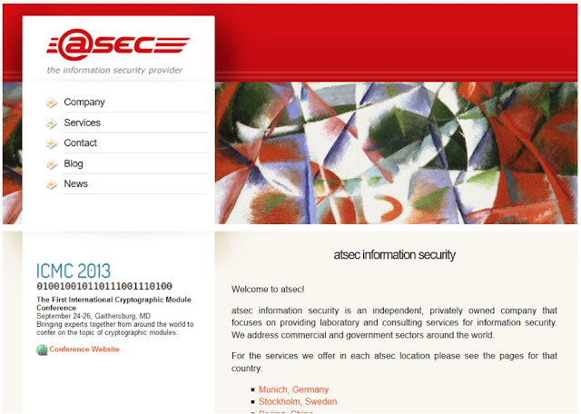
Surprisingly, the website’s design confused many customers and visitors, so it was changed after five years.
In 2015, the website featured motifs echoing elements of Art Deco, a visual art, architecture, and design style of the early 20th century, which highlights a sleeker form style, curving shapes, and simple lines. As one of the first truly international styles, Art Deco could appropriately represent atsec‘s global status and service offerings.
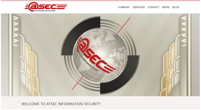
The current website features a modern design, with simple forms and colors that add a sense of space and positive energy. The blue sky represents the boundaries (the sky is the limit, pun intended), the golden globe represents the value of our services to customers worldwide.
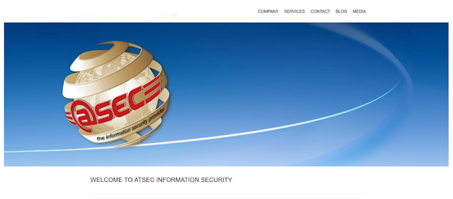
The new web design continues to reflect atsec‘s dynamic team. We continue to evolve, constantly searching, adapting, and creating opportunities for our colleagues, customers, and suppliers.
We remain one of the prominent validation and testing laboratories. Our services are appreciated by our customers, agencies, and even competitors. After more than 21 years, atsec is a significant and independent player in the validation business.
It is a good story to tell.
As we launch the new website today, on the US operation’s 18th birthday, I encourage the new management team to continue the legacy imprinted in the four founding principles.

I want to thank all our colleagues within atsec today, and whoever has contributed to making this company a successful, independent, and enabling platform that allows information security and assurance practitioners to grow and prosper.
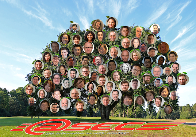
Once more.
…sal.


